Thanks for responding to my call to action!
Oh wait, what??! Know more about Call to Action (CTA) and what this thing I am talking about, read on!
We all visit websites with a purpose in mind, and in return all websites have a purpose to fulfill. Whether it is encouraging users to purchase a product online, register as a member or even simply as filling up a survey form.
Call to Action in web design and in user experience in particular, is a term used for UI elements in a webpage that seek an action from the user. The most popular form of call to action in web interfaces can be seen in clickable buttons that when clicked, perform an action (e.g. “Sign up now!”) or lead users to a web page with additional information (e.g. “Learn more”) that asks the user to take further action.
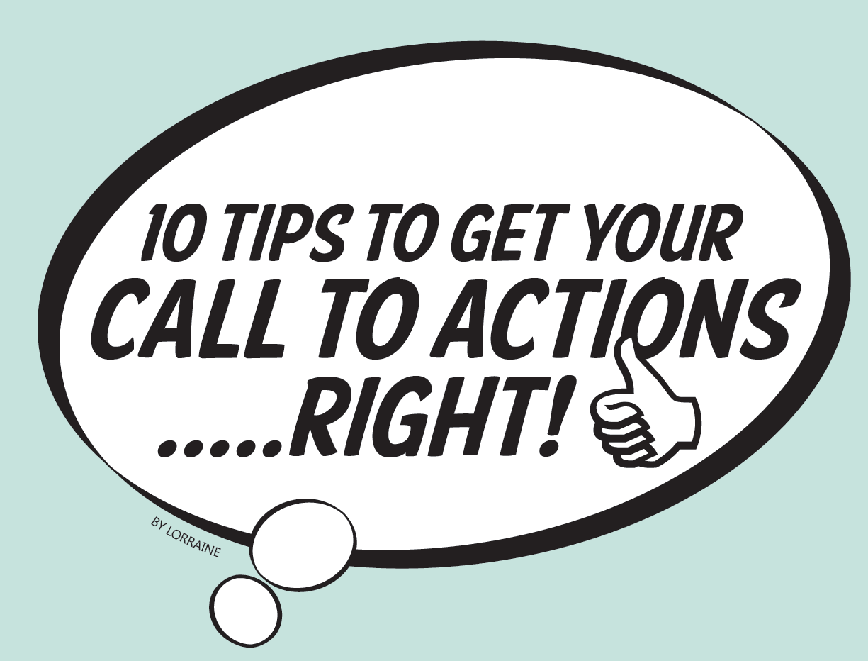
How then do you create an effective call to action? Here are 10 simple tips on design and content for call to action that can help you achieve just that!
1. Placement
Call to actions are placed where they are most likely to be noticed from the rest of the website. Highly visible areas (e.g. top of the website) is the first thing your audience sees and if the button is maintained on all of the webpage in the same location, the audience would most likely click on it to find out where it leads too.
2. SIZE matters!
The size of the call to action button dictates how much importance your user deems the call to action to be. So if the purpose of the site is to sell products online, then the “Buy now” call to action button should be occupying the largest call to action element space in an attempt to grab the reader’s eye. This is especially effective when brands are new, the service or product offered is more important than the brand so size is a way of ensuring that the audience sees the right thing.
3. COLORS
The color of the call to action element is crucial especially for ones placed in the main body of
the website. White space around the call to action button is used to distinguish the call to action from other UI elements on the website. This is more successful when the website background color is not white. If the website is white, use contrasting bright colors such as neon yellow or bright sky blue to draw attention to the .
4. CLARITY
Your site visitors lead busy lives and don’t always have time to think about what you want them to do. Text content for calls to action elements should be as clear and specific as possible. Vague, ambivalent language decreases the value of your offer and makes you seem less credible and confident in your own products. Spell it out and tell your users what to expect when they take action. If you want them to enter their email address, tell them in your call to action. If you want them to click a link, include the words “click here” in the link.
5. EXPECTATIONS
Often, an audience’s hesitation to take action stems from thinking that an action will be difficult, costly, or time consuming. So be descriptive and tell users what to expect by highlighting:
– How easy it is
– What they will expect when they click on this call to action
– How they will benefit from this call to action
6. USE NUMBERS
One way to make your call to action stand out is to use numbers. Numbers break up text-heavy content and catch the reader’s eye. Numbers in the form of statistics are especially useful in gaining trust from your consumers and marketing why your product is good for them.
7. ASK QUESTIONS
When your call to action is centered around a question, you interact with audiences in a way that they are often compelled to answer. When designing a call to action button, anticipate the potential questions users will have in mind, and make sure that you answer them in time. This example here anticipates the question of “how much will a quote cost me if I were to invest my time in going through this process?”
8. URGENCY
Phrasing the action by using bold, confident words can alter the user’s perception in ways that convince them that they shouldn’t wait any longer to take action. Using words such as “now”, “immediately” and “right now” can convey such urgency and a need to act immediately. Use active verbs such as “buy”, “register” and “sign up” whenever possible to clearly tell users what you want them to do.
9. VALUE
Always keep in mind that audience will only click on your call to action if they believe they can gain some value out of doing so. Consider the top 2 or 3 most valuable benefits of your offer. Choose the most important one, and then try to distill it in as few words as possible. This will help to emphasize the value of your offer and strengthen its alignment.
10. CHOICE
Offering a choice of actions not only helps in making the CTA more attractive and interactive, it is also sometimes necessary where primary actions are required for a specific action (e.g. getting a free trial before the real thing). This set of call to action buttons uses vertically-arranged grouping to indicate the desired order of importance for actions made available to the user. The desired primary action is to get an estimate, followed by getting details about the service, and lastly, to compare and contrast between different plans.
